Donate! (It's people like you, that help students like us!)

Tuesday, January 19, 2010

Is it soup yet?


Project 2.
A 4-page layout.
Sounds easy enough, right?
But after 2 weeks of sketching, prepping, shooting, post-production and critiques this project seems like anything but easy for every one in this class.
Class lectures are just a thing of the past, group and 1:1 critiques is how we roll.
Talking among ourselves as well as pitching layout concept to the professors can be the most productive thing to occupy class time. However, the dreaded "re-shoot" is always looming at the end of any discussion.
Kerning, saturating, moving, tweaking. I'm sure we're just preaching to the choir saying it really is a never ending process (and more so, no one is satisfied.)

Let's see...today is the 19th. That means in 2 days (on the 21st) we have the completion of the second project among us!
2 days. 48 hours. 2880 minutes.
Let the frenzy begin!
We'll let you know how it all pans out.
Tuesday, January 12, 2010

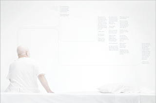
Maruska + Gomez Project#1 Feature


Designer Andrew Maruska Talks about his work with Photographer Ariana Gomez

Ariana and I really wanted to tackle the first project in a very conceptual way. Our good friend Evan Stark had written a short story that he was willing to share with us, and our concept quickly took off. The story is about a man who comes to a young man and convinces him to kill his brother. After the seed festers in the boys head, he has no other choice but to commit the vile act. A confrontation occurs and when the dust settles, the brother is unscathed and filled with remorse it was not on his terms.

We really wanted to add a second layer to the story with our photograph. Placing our model into a stark white room, we tried to elude that he may be a mental patient, which does creates several influences on how, where, and what this story is really about. The old man has now become several different people at once, is he the man in the beginning of the story? is that man the father? is that man the brother in later years? or does this story completely fabricated in this mans head? We have our own theories, but we would rather leave it open to the reader to taint their own experience with our visuals to the story.

Wednesday, January 6, 2010

Kasarda + Fuqua Project#1 Feature


Designer Katie Kasarda talks about her project with Photographer Abby Fuqua about their project #1 spread.

Pretty much what Abby and I wanted to go for from the beginning was a negative but with a tad bit of humor. It was a mutual decision before we even started thinking about the project that we were going to do a negative (I guess we were having a bad day) and thought about things that we really hated. We settled on bad hair days as a whole because who seriously wants to even go outside when you're having one? Throw a hat on or just cry all day about it (maybe that's just me). We wanted to get the overall feeling of anxiety that you get during these days, but I liked our decision to keep it light and humorous, even though it was a negative.

Shooting was pretty fun. Our model, Jill, was very cool about Abby messing around with her hair like nuts. Oh, and super kudos to Abby for whipping out her styling skills. That was great and she totally had me cringing, in a good way, about how nuts Jill's hair was getting. Overall I think we worked very well together and I'm happy with the outcome.

Sunday, January 3, 2010

Pecoraro+Luessen Project#1 Feature


Alright, we're still getting features write ups from photographers and designers. Photographer Robert Luessen talks about his work with designer Steve Pecoraro.

"For the first spread, Steve and I worked together on a spread about particle theory and time travel. With both of us naturally inclined towards science-based publications like Wired and Discover magazine, we chose an article that dealt with the Large Hadron Collider, a particle accelerator in Europe. Essentially, our article focuses on two prominent particle physicists who claim that the scientific device is actually sabotaging itself from the future to prevent scientists in the present from making world-altering and potentially dangerous discoveries. Crazy stuff.

Visually, Steve and I were on the same page from the start. I think his minimalistic, almost Bauhaus design compliments and enhances the photograph that we created exceptionally well. I should also say that the success of the photograph is a result of a collaborative effort between Steve and Nicole Murtagh art directing, Jackie Allen styling and me photographing (I swear I did more than just click a button). I think the spread as a whole, and especially the photograph exemplify the phrase that "[the] whole is greater than that sum of its parts."

Saturday, January 2, 2010

Poulin+Walsh Project#1 Feature


Designer Rachel Poulin and Photographer Marie Walsh worked on this spread for the first project this year.Here is what Rachel had to say
"This spread focuses on profiling a tattoo artists from Long Island, currently working in Buffalo, named Jason D'aquino. The way he works, he never does drawings larger than one square inch, which is where the title of the article, "The Miniature Minimalist" comes from. He then takes these drawings and blows them up to be larger for the actual tattoo."

Thursday, December 24, 2009

BRB

Thank you for viewing Positive Negative.
Please hold for the Holidays.
Your comments will be answered in the order they were received.
Please enjoy the yule log while you frantically refresh the page until we return.
Thank you, and have a wonderful day.

Tuesday, December 22, 2009

Everyone Deserves a Break. Just not us.

Project One: Check.
Project Two: Next.

These past few weeks have kind of been a blur for many of us in this class.
It seemed as if we just started the new semester after Thanksgiving break.
As winter quarter just started to become our new routines, here we are; dispersed all over the country on Winter(Holiday/Christmas)Break.
Here at good old RIT, we have this lovely thing called the "Quarter System".
(To clarify,this means there are 4, 10 week terms throughout the year. The other type of calendar system is the semester system. There are usually two main semesters a year (fall & spring); each running between 15-17 weeks depending on the school. )
Imagine being a student (much less an art student) only having 10 weeks per class.
That averages just over 3 projects in 3 weeks (with a week for finals, of course).

This publication we're undertaking would take easily, several months to perfect and make "print ready" with any other group.
But us, we're special.
Not like the special your mom ensures you that you are.
I'm talking like the real "you-work-your-ass-off-and-it-creates-an-insane-work-ethic-and-personal-drive" special.
I think many people don't realize (or underestimate) the integrity of work RIT students hold.
Among our peers, more often than not we are very prepared for the industry.
Fast paced, and get it done yesterday mentality is more or less taught in art foundations.
I'm not joking. It's pass/fail.

Don't just flip through these pages and say "cool".
Take your time and look at each one.
For making flawless designs, and immaculate pictures in just a few weeks time is a skill and a gift.
I said I was impressed with this group.
I whole deeply mean it.

Stay tuned. Stay classy.